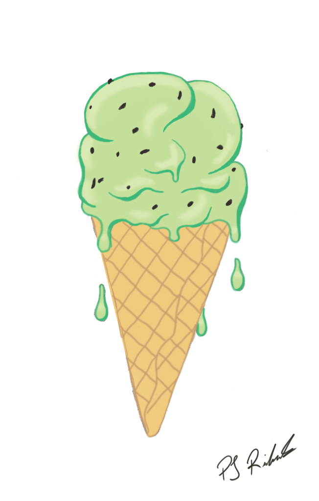
 Here is my IF for rescue. Now I am going to have to explain this one. The reason that I have chose to do a ice cream cone is because after a long day of skateboarding a milkshake or an ice cream is a staple to cool down for myself and the friends I skate with. My friends and I more often than not stop by Sammy's on Wilson st. in Ancaster after a longboard or skate sesh (they will even put a banana in the milkshake if we bring one). I find that it rescues my friends and I on the hottest of days and allows us enough energy to continue on skateboarding! The sugar high can't hurt either!
Wednesday, April 7, 2010
IF: Rescue
Here is my IF for rescue. Now I am going to have to explain this one. The reason that I have chose to do a ice cream cone is because after a long day of skateboarding a milkshake or an ice cream is a staple to cool down for myself and the friends I skate with. My friends and I more often than not stop by Sammy's on Wilson st. in Ancaster after a longboard or skate sesh (they will even put a banana in the milkshake if we bring one). I find that it rescues my friends and I on the hottest of days and allows us enough energy to continue on skateboarding! The sugar high can't hurt either!

IF: Expired
 This here is my IF for Expired. It is a vector based image done completely in adobe Illustrator CS4. I like the way that the shading turned out, and the teeth took me quite a while but i think that they turned out pretty good. I feel that scull and crossbones depict expired quite well and also give quite a pirate feel which i am quite a fan of! Just think of a ghost pirate ship!
IF: Subterranean
 This little guy is just about to come outside after a week of hard digging to enjoy the rain. This is the character that I came up with for my IF: Subterranean I sketched the original with pencil on a sketch pad then scanned it in and coloured it in photoshop.
Thursday, April 1, 2010
Promotional Postcard
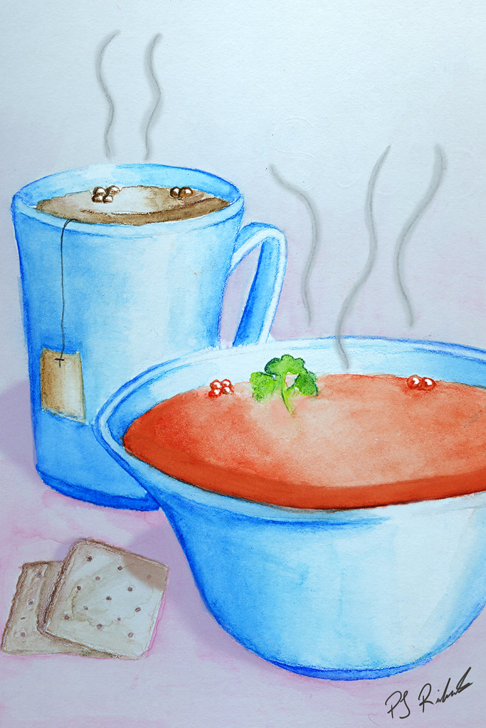
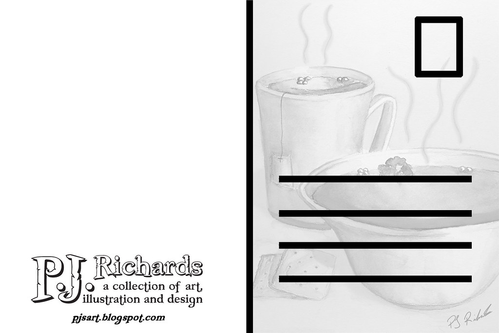
I chose to take a piece of artwork that i did in class last semester to be used as my promotional postcard piece. I just had a lot of fun creating this piece of work. I feel that it the reason that it is a good choice to promote me with.
Thursday, March 25, 2010
Ride for Cancer Research
Hey everyone!
This is the illustration that i came up with for the postcard art request of Tom Wolfe. Tom's campaign is to ride with Lance Armstrong in kitchener on Aug 28th for cancer research. As Tom and many others have said, "cancer has affected us all" so for my illustration i went for an approach of loved ones who have passed cheering on a bike rider. It is a pretty literal approach to the assignment but I when brainstorming it was the idea I though would work best. I have supplied two versions of the piece one with a lens flare and one without. I am leaning toward the one with the flare but i was wondering what others think. so if you have a second let me know! I started the piece in Corel Painter and went for a somewhat coloured storyboard look then finished off the rest in Photoshop.

 Thanks for checking it out
Wednesday, March 17, 2010
Photo and No Photo Reference
Here are my 3 photo reference storyboards
This first one is a shot of the aquatic center

This storyboard is of the diver climbing his ladder

This storyboard is of the diver preparing to pour cereal in his hand

These here are 3 of my storyboard frames done with no photo reference.
This first one is a shot of the aquatic center
This storyboard is of the diver climbing his ladder
This storyboard is of the diver preparing to pour cereal in his hand
These here are 3 of my storyboard frames done with no photo reference.
the is a shot of the whole aquatic center with no photo reference.
 This is the shot of the diver climbing the divingboard from with no photo reference.
 this is a shot of the diver pouring some cereal in his hand sketched with not phot reference but looking down at myself.

 This is the shot of the diver climbing the divingboard from with no photo reference.
 this is a shot of the diver pouring some cereal in his hand sketched with not phot reference but looking down at myself.

Rough Storyboards
These are the rough storyboard sketches for my made up trinkets cereal commercial. being that my cereal theme is pirates i came up with diving as a theme. The reason i feel that this relates is walking the plank. I decide to make the comercial for a nervous diver and the trinkets work as a somewhat safety blanket for him, helping him loose his nerves. The idea is similar to the statement imagine the crowd in their underwear, but in this he imagens the crowd to be pirates. take a look!


Subscribe to:
Posts (Atom)
