Friday, April 23, 2010
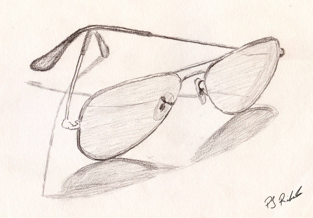
IF: Detective
This is my illustration for IF: Detective. I chose to illustrate sunglasses because a friend and I were talking about the hilariously horrible lines that Horatio from CSI Miami uses as he takes off his glasses in each episode. I know his title is not actually a Detective but he does do detective work solving murders each episode.


IF: Linked
Rick's Blog
These are the images that i created for Rick Court's Blog
The first image i created is a combination of all of Rick's hobbies. Combining a book for reading, a golf ball on a tee for golfing, and a map for traveling

The second image is a tie made out of money representing that he gave up money to wear a tie to work.
The third image that i created is representing riding a bike 22 blocks which i represented with a 22 dash arrow.

The first image i created is a combination of all of Rick's hobbies. Combining a book for reading, a golf ball on a tee for golfing, and a map for traveling

The second image is a tie made out of money representing that he gave up money to wear a tie to work.
The third image that i created is representing riding a bike 22 blocks which i represented with a 22 dash arrow.

Wednesday, April 7, 2010
IF: Dip
IF: Rescue
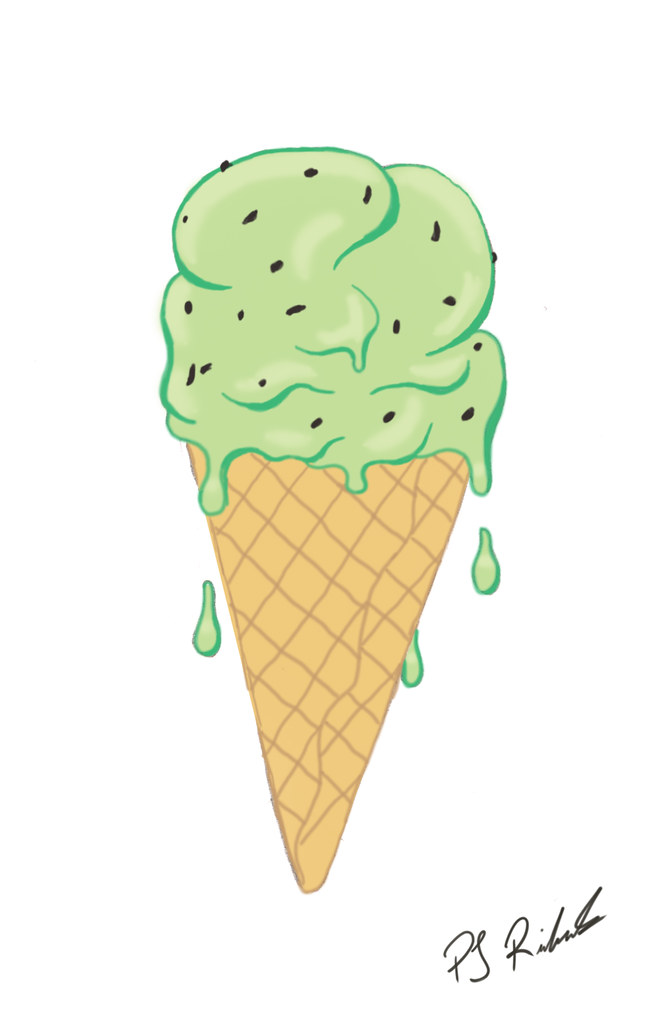 Here is my IF for rescue. Now I am going to have to explain this one. The reason that I have chose to do a ice cream cone is because after a long day of skateboarding a milkshake or an ice cream is a staple to cool down for myself and the friends I skate with. My friends and I more often than not stop by Sammy's on Wilson st. in Ancaster after a longboard or skate sesh (they will even put a banana in the milkshake if we bring one). I find that it rescues my friends and I on the hottest of days and allows us enough energy to continue on skateboarding! The sugar high can't hurt either!
IF: Expired
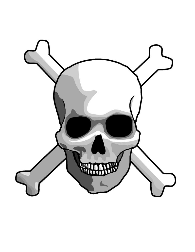 This here is my IF for Expired. It is a vector based image done completely in adobe Illustrator CS4. I like the way that the shading turned out, and the teeth took me quite a while but i think that they turned out pretty good. I feel that scull and crossbones depict expired quite well and also give quite a pirate feel which i am quite a fan of! Just think of a ghost pirate ship!
IF: Subterranean
Thursday, April 1, 2010
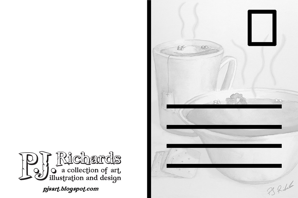
Promotional Postcard
Subscribe to:
Comments (Atom)
